Major project
Explore how the experience of shopping for clothes makes people have more positive body image.
BestU- an online community that support body positivity
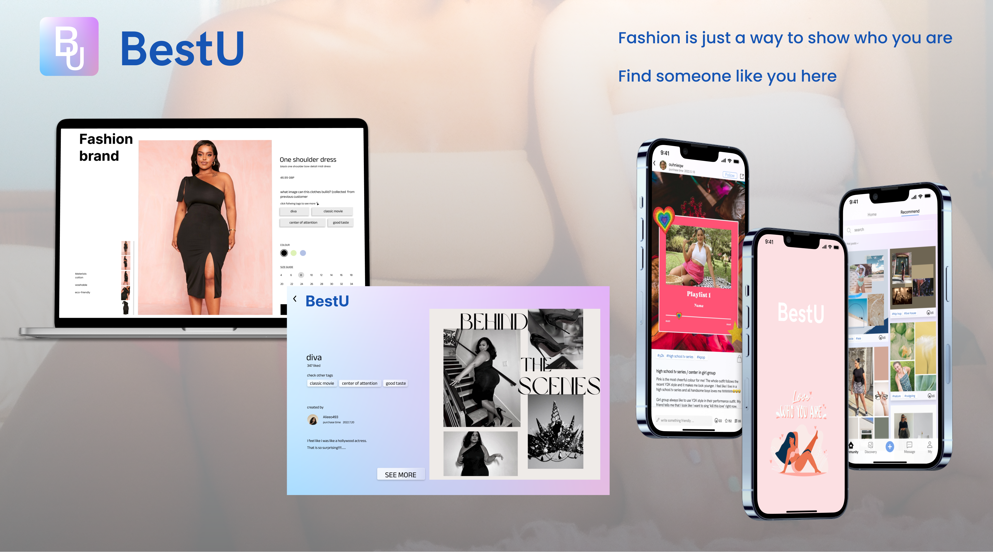
BestU is an online community that can strengthen the connection between clothes and personality, image or interests in order to let users focus less on the relationship between body image and clothes. The touch point is the tag on the product page. Some keywords are on the tags, like “outgoing” and “movie lover”. BestU enables users to gain positive feedback and find similar people based on these tags. They can focus on whether clothes can show their personality rather than make their body shape look better in a long time.
Background
According to a government report, 86% of 18-34-year olds are not satisfied with their body. At the same time, 76% of people think fashion would increase this dissatisfaction. They may use unhealthy ways to have an ideal body shape or have self-abandoned behaviours, which is against the good health and well-being in UN Sustainable Goal. Nowadays, customers have put increasing pressure on fashion brands and retailers to get inclusion right and deliver a body-positive fashion experience. How to improve body-positive in shopping experience will be a future trend in the fashion industry.
I am going to research the shopping experiences of people who do not always find shopping a positive experience, to understand the user journey and their satisfaction with clothing fit and appearance so that I can design a solution that enables them to have a positive outcome in terms of their body image.
User research
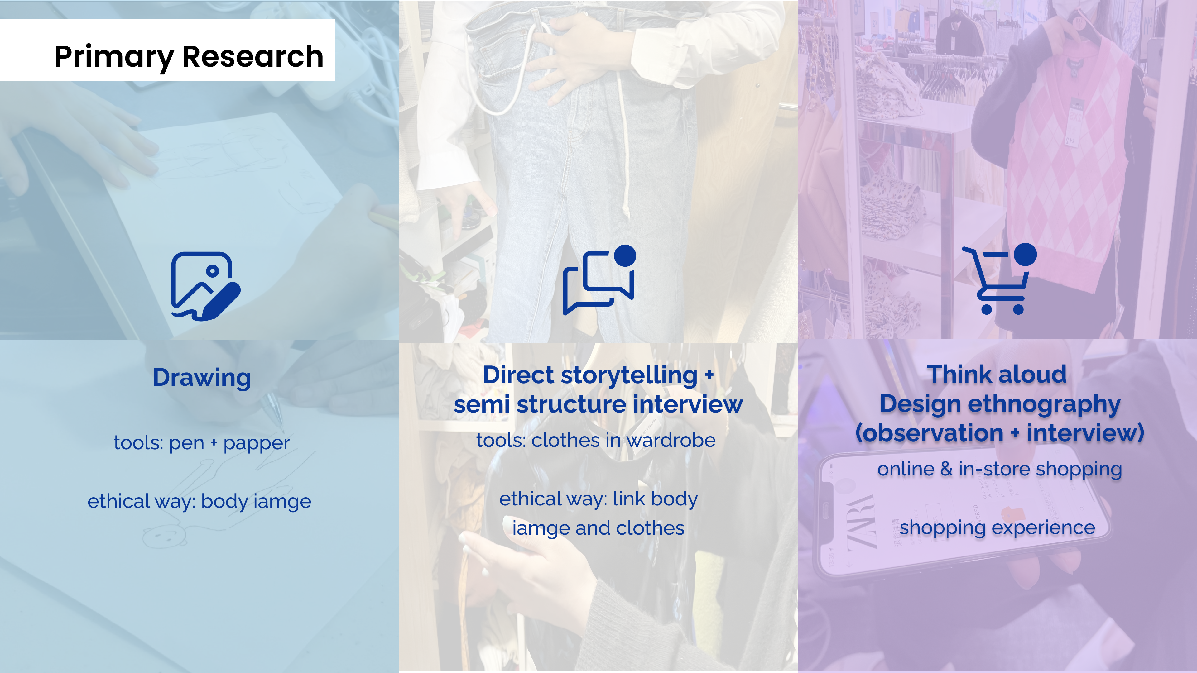
Method: Drawing
Content: 6 participants were asked to draw their own body image and they would explain why they draw like this.
Why: Ethics issue. can not ask them directly about how they feel about their body.
used drawing to know their attitude towards body image.
Method: Direct storytelling + semi-structured interview
Content: came to participants’ houses to let them select some clothes that make them feel confident and unconfident. I led them to talk about the shopping experience and the story of these clothes.
Why: This is a way to remind them of their shopping experience and enable me to understand what aspects of clothing may impact on body image. Let participants talk actively, and they may talk about more surprising things.
Method: Think aloud+ Design ethnography (observation + interview)
Content: Participants were asked to select some clothes and speak out about their thoughts and feelings during the shopping. This can help me to know which parts or situations impact on body image.
Why: This can help me to know which parts or situations impact on body image in real scenarios.
Insights and UX vision
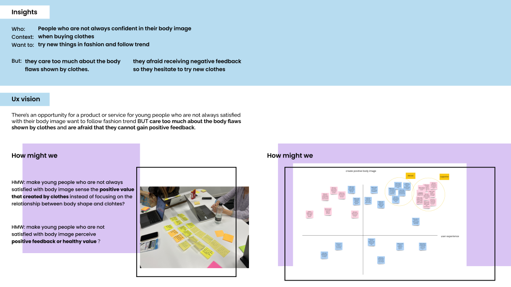
After analysing data (Affinity Diagramming), I found the following insights. Young people who are not always confident in their body image want to try new things in fashion and follow trends, but they care too much about the body flaws shown by clothes and are afraid to receive negative feedback, so they hesitate to try new styles and have negative feelings. There is an opportunity to solve these problems.
For brainstorming diverse, meaningful and relevant solutions, I used How Might We (HMW) and discussed it with other UX students. The first one is to let users sense the positive value created by clothes instead of focusing on the relationship between body shape and clothes. the second one is to make them perceive positive feedback or value.
Ideation and Competitor analysis
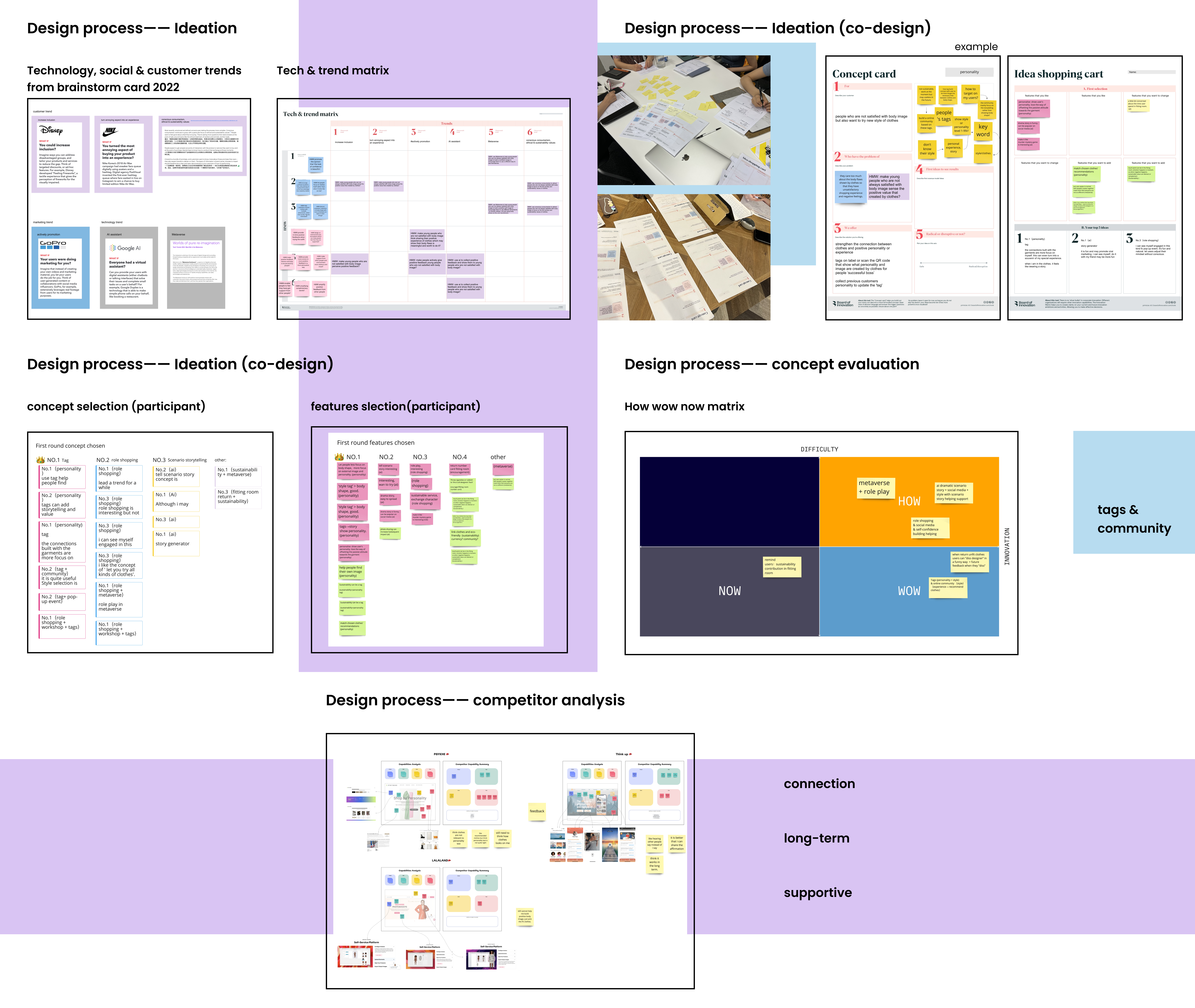
For exploring innovative opportunities in diverse areas, I used brainstorm cards which were about recent customers, technology & social trends. When I used the cards, I combined some possible trends with my HMW into initial concepts. By applying different trends, it will make the concepts more actionable.
For further developing my concept, I invited users to join my co-design. I made formal co-design for 2 times with different participants because I would like to hear diverse opinions. The number of previous participants in user research is not enough, so I recruit new participants. I believe they can bring different points of view that inform design and innovation direction based on their own experiences.
For better explaining my idea, I used concept cards to summarise it. The card records the content of the concept, related how-might-we and insights. In co-design, I introduced my several concepts first and then they discussed their thinking. During the discussion participants used a form called idea shopping cart to choose favourite features, features they want to change and features that they want to add. After discussion, they can write down their top3 concepts and explain why they like them. Idea shopping cart is to ensure a sufficient variety of ideas and facilitate all participants’ individual selection processes.
After co-design, I ranked the participants’ favourite concepts and features. “Tags” is the most popular. The others are role shopping, scenario storytelling, metaverse, interesting return system. And then I change a little bit of these concepts based on participants’ opinion and their favourite features. As for the tag concept, a suggestion was to create an online community for users to make a long-term mind change.
After making changes for each concept, the How-Now-Wow matrix helped me categorize ideas according to ease of implementation and level of newness. I selected the WOW ones, which are both innovative and easy to implement. According to the result, I picked the tag & community concept. I didn’t pick the other one in wow zone which is to use a funny way to diss designers when they return unfit clothes, because it may have ethical issues.
I learn about my competitors by knowing their strengths and disadvantages and having evidence to back up design changes. In a fashion recommendation website, users need to do a personality test first and be recommended items based on the test result. According to my and the participants’ feedback, we agreed that the personality result seems to be irrelevant to the recommended item. I should show the connection between tags and clothes. The other is mind change needs a long time and positive trigger. An app called think-up ask users to read different affirmation in a long time. My participants thought perceiving supportive information in a long term will work, which is also mentioned in the insights.
Key features and Concept
Full video prototype: https://youtu.be/E2QOrOsSG8w
I want to strengthen the connection between clothes and personality, image or interests in order to let them focus less on the relationship between body image and clothes. The touch point is the tag. Some keywords are on the tags, like “outgoing” and “movie lover”. Also, there is an online social community for users to gain positive feedback and find similar people based on these tags. They can focus on whether clothes can show their personality rather than make their body shape look better in a long time.
When users shop for clothes, they will see the tags with some keywords. they are about characteristics that relevant to clothes, which are posted by previous customers in the online community. After they join the online community, different tags are different groups. Users can see how other users dress to show the personality with mood board and word description.
This platform recommends outfit based on different groups, and there are different ways to encourage supportive activities. The details of these functions and why they are in my concept will be explained in the following design process.
Why do I use tags about personality?
The first reason comes from the insights & HMW. Secondly, my participants like things that show who they are even clothes cannot make their body shape better. The third is the tags. An assistant in the fashion industry told me that fashion brands like to print extra information on swing tags. Customers and brands both think it is a good way to get information.
Why do I build an online community?
Users can get positive feedback and supportive information in the community. If I just use the tag, they have a positive feeling at that moment. the online community may have a lasting influence by sense of belonging. The third comes from co-design & competitor analysis. Participants like to be recommended clothes based on their personal experience or personality. An online platform can meet their needs better. They will know their unique characteristic inadvertently. In a Dove self-esteem project, it mentioned that if people can know their advantages, they will build self-love and self-esteem.
Detail function (website)
Let me explain some design decisions. Firstly, I talked to a stakeholder. She is in Boden customer department. She talked about authenticity. How do make users trust tags are collected by real customers, not influencers who have been paid? I decided to show more information about the source of the tags. showing more users’ information like purchase time and pictures will increase the authenticity. Also, diverse photo quality and style can help that.
The next one also comes from my stakeholder. showing users' information needs to follow the GDPR laws. how to manage data protection? How many people need to take charge of it? At first, the tags on the product page are random, but this needs a lot of data management, so I changed it into just popular tags. I also changed the idea of an individual online platform that linked to diverse fashion brands into a “single fashion brand company and its online community”. Fewer products can reduce the large amount of data processing.
Detail function (app)
Full function video: https://youtu.be/E-ZUJaef0eg
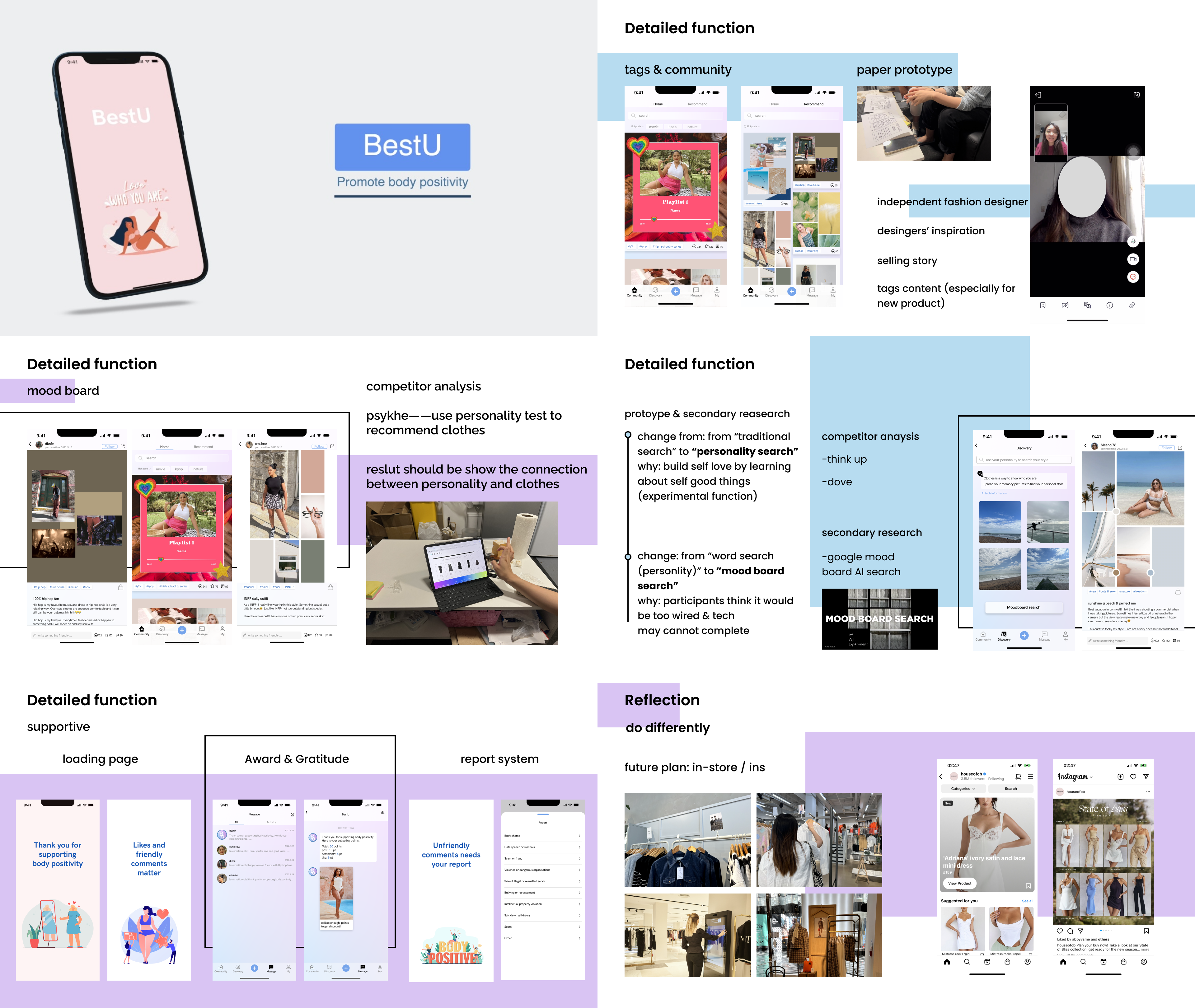
After the paper prototype, I made some small UI design change. Paper prototype can make rapid iterations and users can use the pen to draw down their ideas. I also talked to another stakeholder, a fashion designer. She told me that some designers like to tell customers about design inspiration. Many designers’ brands like to sell stories not just clothes. I think designers’ inspiration could be the content of the tag, especially for new items.
One of the key differences between my community and other social media is the mood board. This comes from competitor analysis. Users may get confused when they cannot see the connection between tag and personality directly. So I used a mood board to help users to explain their inspiration. They can use relevant pictures around the outfit to show the connection.
The next one is an experimental function. Apart from traditional search, users can use their own personality or other personal experience to search for suitable clothes directly. This is based on the theory that building self-confidence needs to learn about self-characteristics. My participants think it would be too weird to write down characteristics, and the technology cannot help to do this well. So, I did some secondary research to look for any other technology that can support it. I found that google has a technology called mood board AI search. After uploading pictures, AI can analyse and find mood board. I think it can apply to my platform. I suggest users upload their memory pictures to find a personal style.
As for the supportive function, I try to create a positive atmosphere. There will be friendly slogans about body positivity and encourage positive activities on the loading page. The second one is to provide awards and show good feedback when they finished the positive activities. When they post, comment, or give a like, they can gain points to get a discount for shopping. And the report system will take body shame as the main report reason. If it identifies the above activities, the points will be deducted.
If I get more time, I will apply my idea to in-store shopping. In body storming, I found customers may not notice the extra information and tags first. maybe an interactive screen can attract their attention. When they come close to the screen, the tags will show up. A report reveals that online shopping on social media is becoming more popular. My concept can also apply to social media like Instagram.
Jingyi Zhou
Major project
Explore how the experience of shopping for clothes makes people have more positive body image.
