I am a product designer with background in industrial design and I design user-centered user experiences and interfaces.
Major project
Chichi
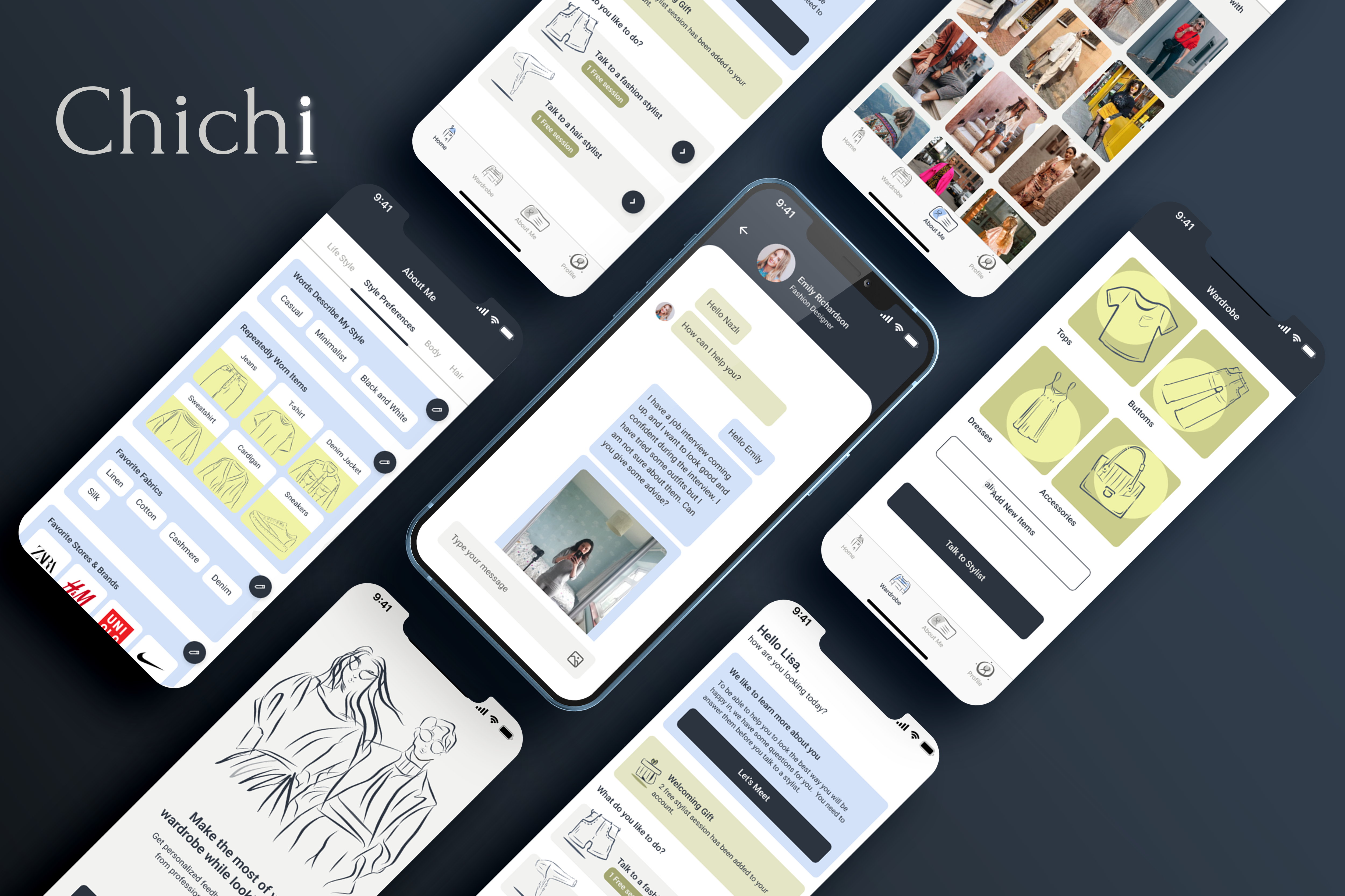
Chichi | Looking chich without being a stylist
Chichi is an app helping young adults who want reassurance that they have a good style and are looking good by reducing their insecurity about making decisions with their style and giving them personalized feedback and support from professionals.
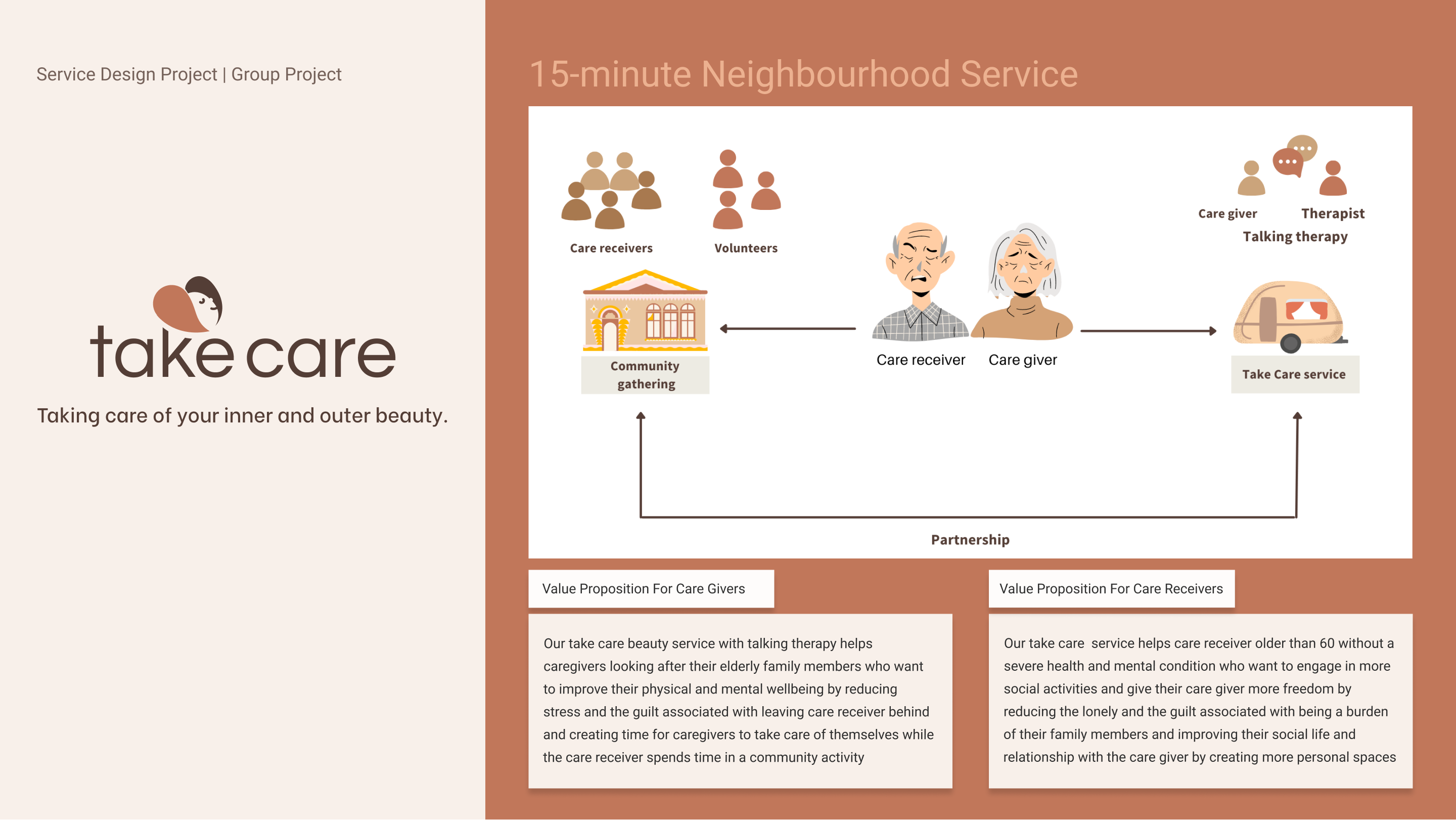
Take Care | Service Design
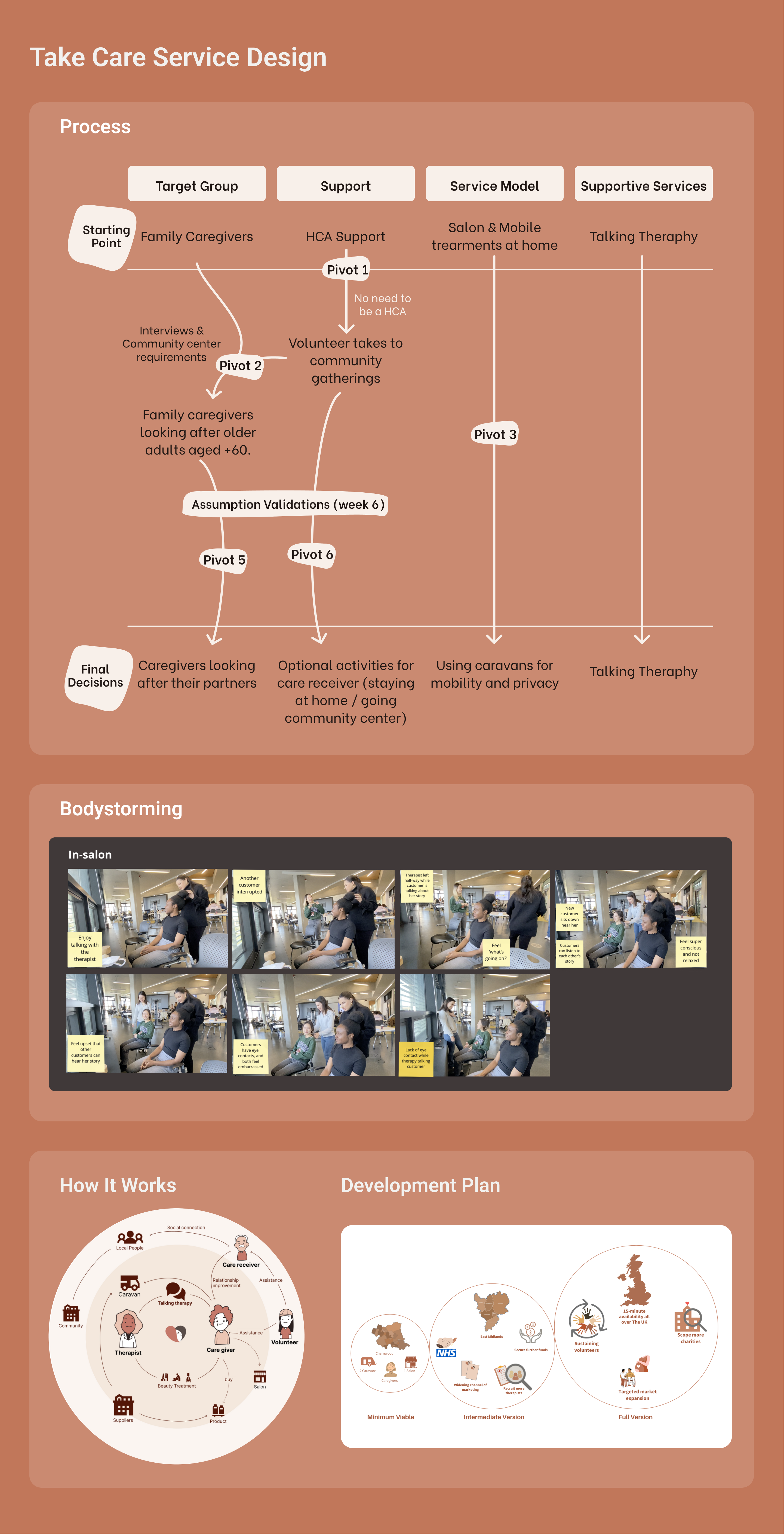
Take Care is aimed at older adults who care for a partner. The service aims to create time for these individuals to invest in themselves and boost their confidence by receiving well-being treatments such as massages, hair, and nails.
It has two forms: a Take Care caravan that moves to different 15-minute neighbourhoods in the Charnwood area and a town centre, bricks-and-mortar salon. The caravans will be set up in predefined locations daily.
Take Care works with volunteers and charities that host community gatherings for care receivers. The service can help reduce the guilt of leaving a partner behind while taking care of yourself.
Another benefit of the service is the optional talking therapy caregivers receive whilst having treatment.
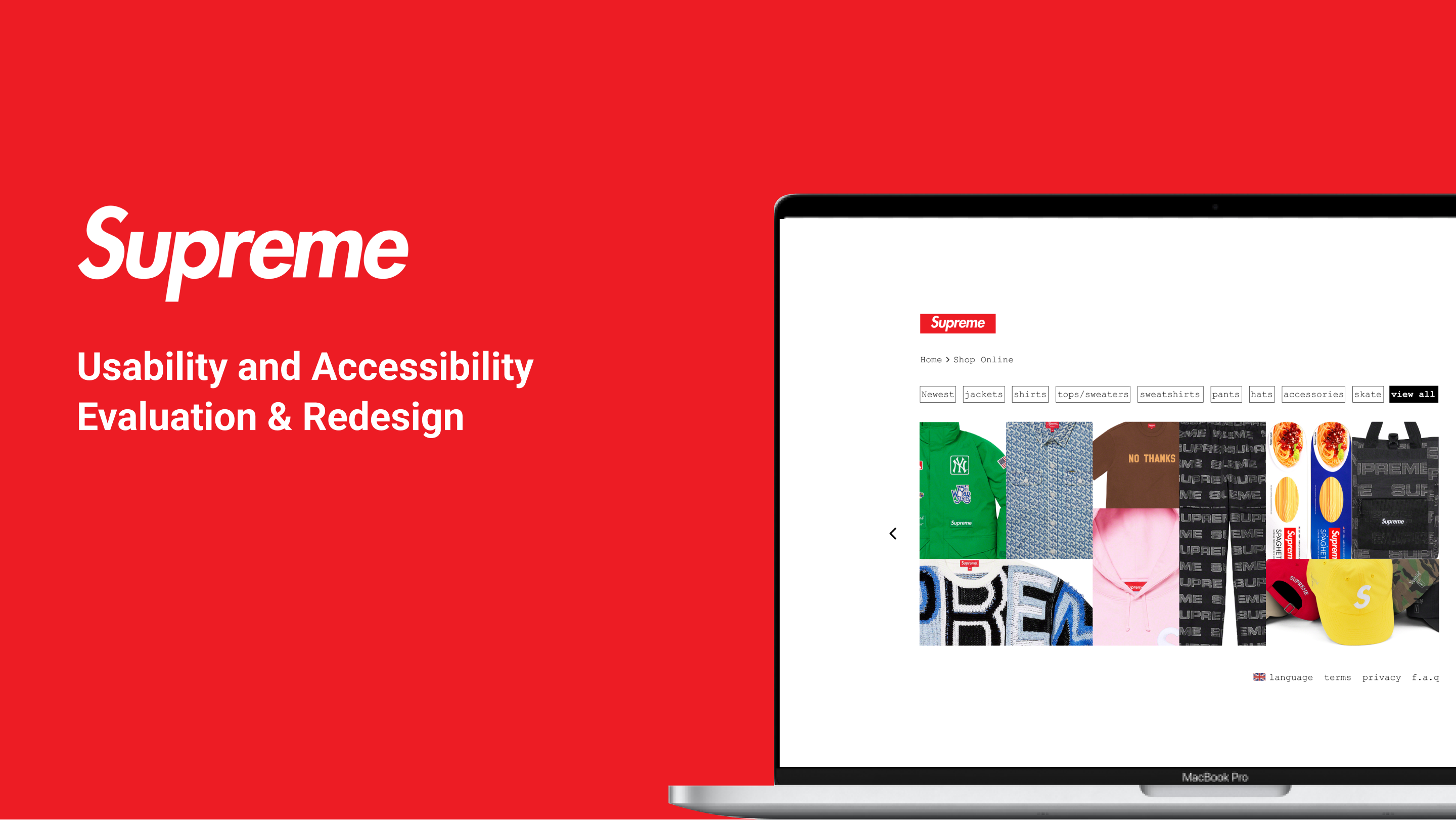
Supreme Usability and Accessibility Evaluation & Redesign
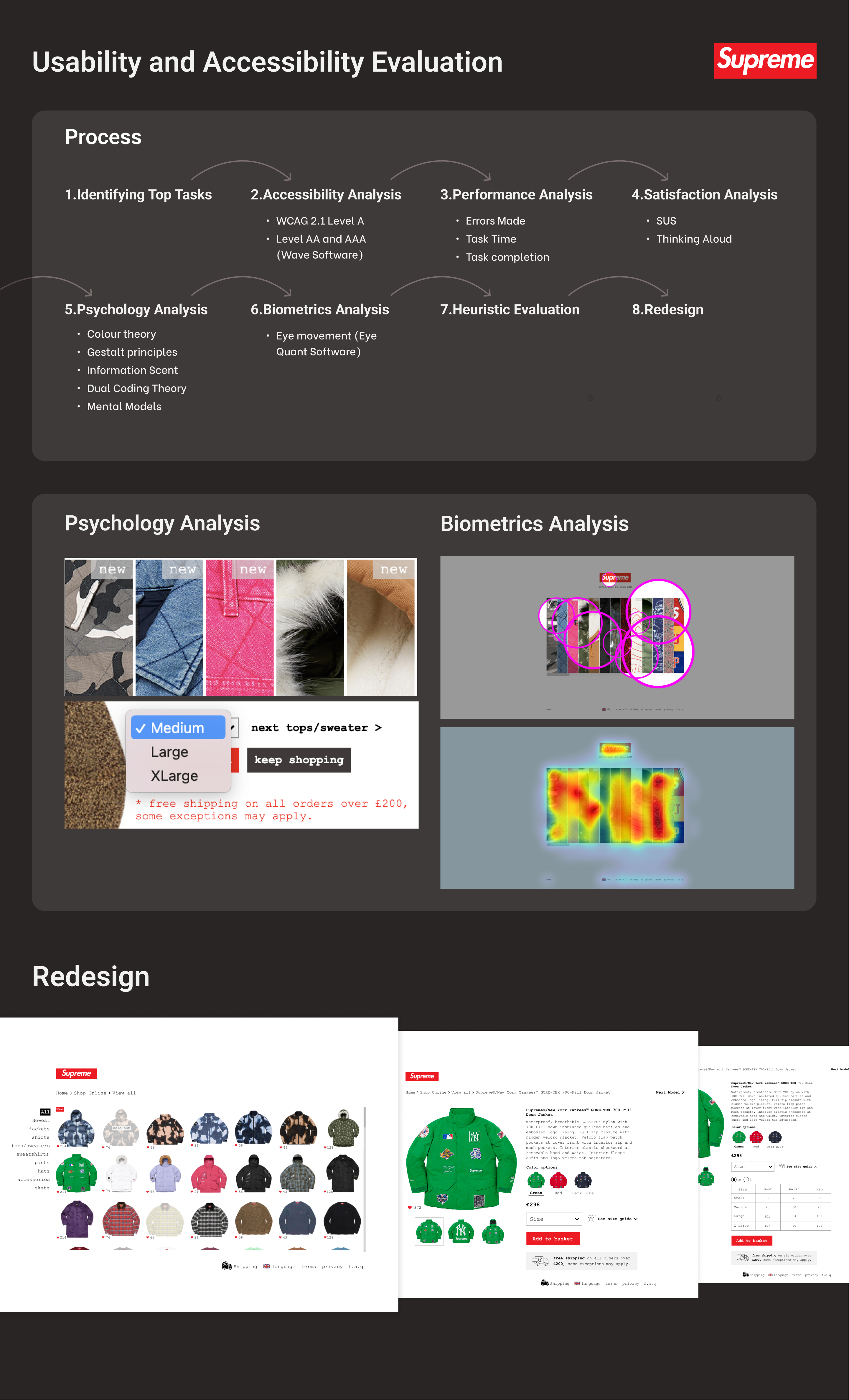
Supreme.com was evaluated to identify usability and accessibility issues users encountered while achieving top tasks. Several evaluations were conducted to assess website usability, including accessibility, performance, satisfaction, psychology, biometrics, and heuristics. By using statistics, performance scores were calculated and compared with Rick Owens as its competitor. After collecting data from different evaluations, a redesign suggestion was made to improve the usability and tested to see whether it performed better.
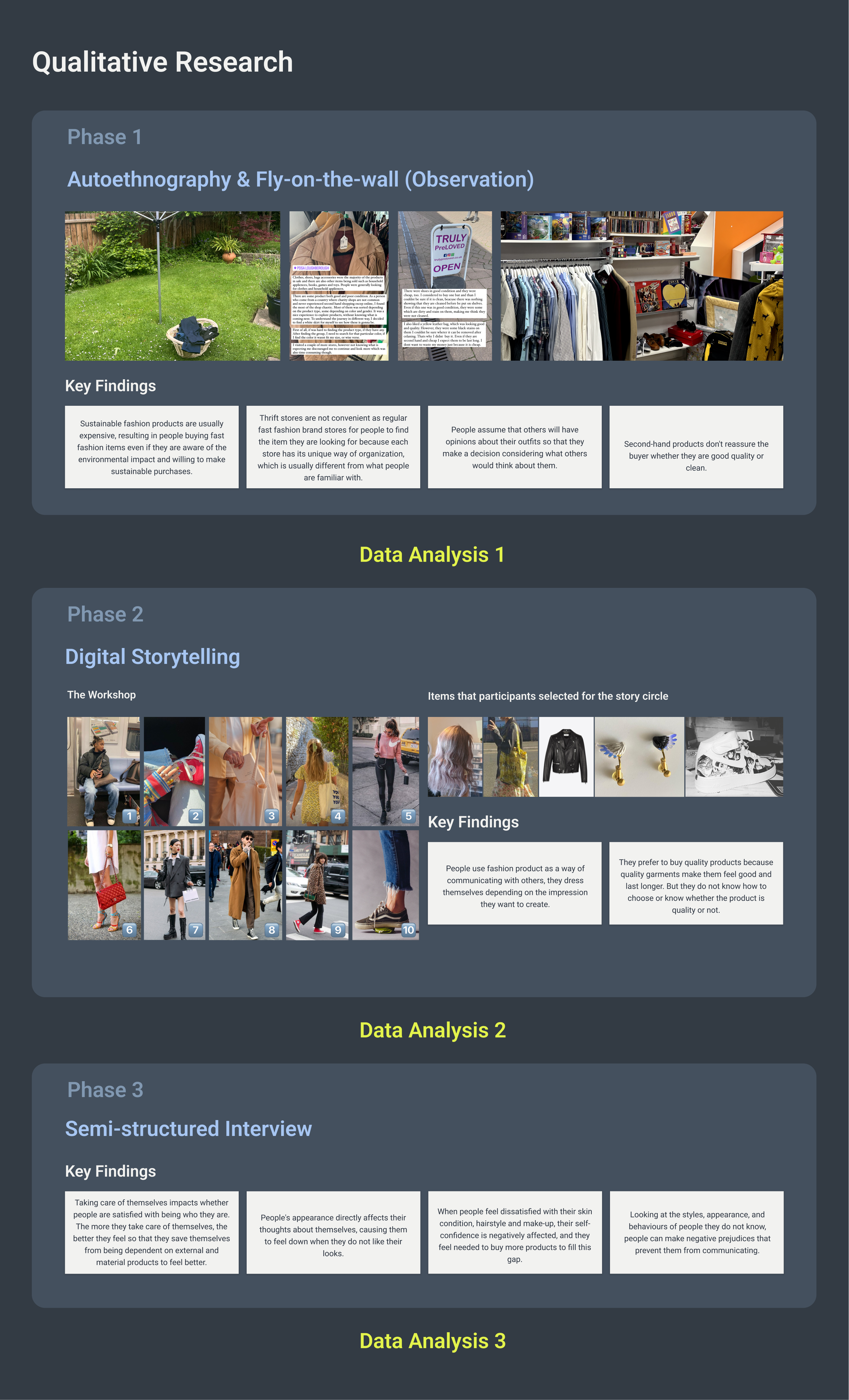
Chichi Discovery Phase - Qualitative Research Process
The first phase of qualitative research started with the autoethnography method to understand the relationship between self-image and behaviours regarding fashion in different contexts.
In the second phase, I employed digital storytelling because group discussion and storytelling would help participants express opinions easily on an abstract topic like self-image. The workshop took place with five people aged 22-32 recruited via convenience sampling.
We started with a warm-up activity where they discussed images in the top right corner, saying what they thought and felt about them. Then, each participant told the story behind the item they’d selected, and we ended the workshop after having more group discussions. The participants were expected to create a 2-3 minute digital story by writing a first-person narrative about their relationship with fashion and recording their voice-over, combined with relevant images.
After they conveyed their stories through videos, I conducted a follow-up interview to ask questions regarding their videos and get more in-depth insights.
Chichi Data Analysis and Concept Generation
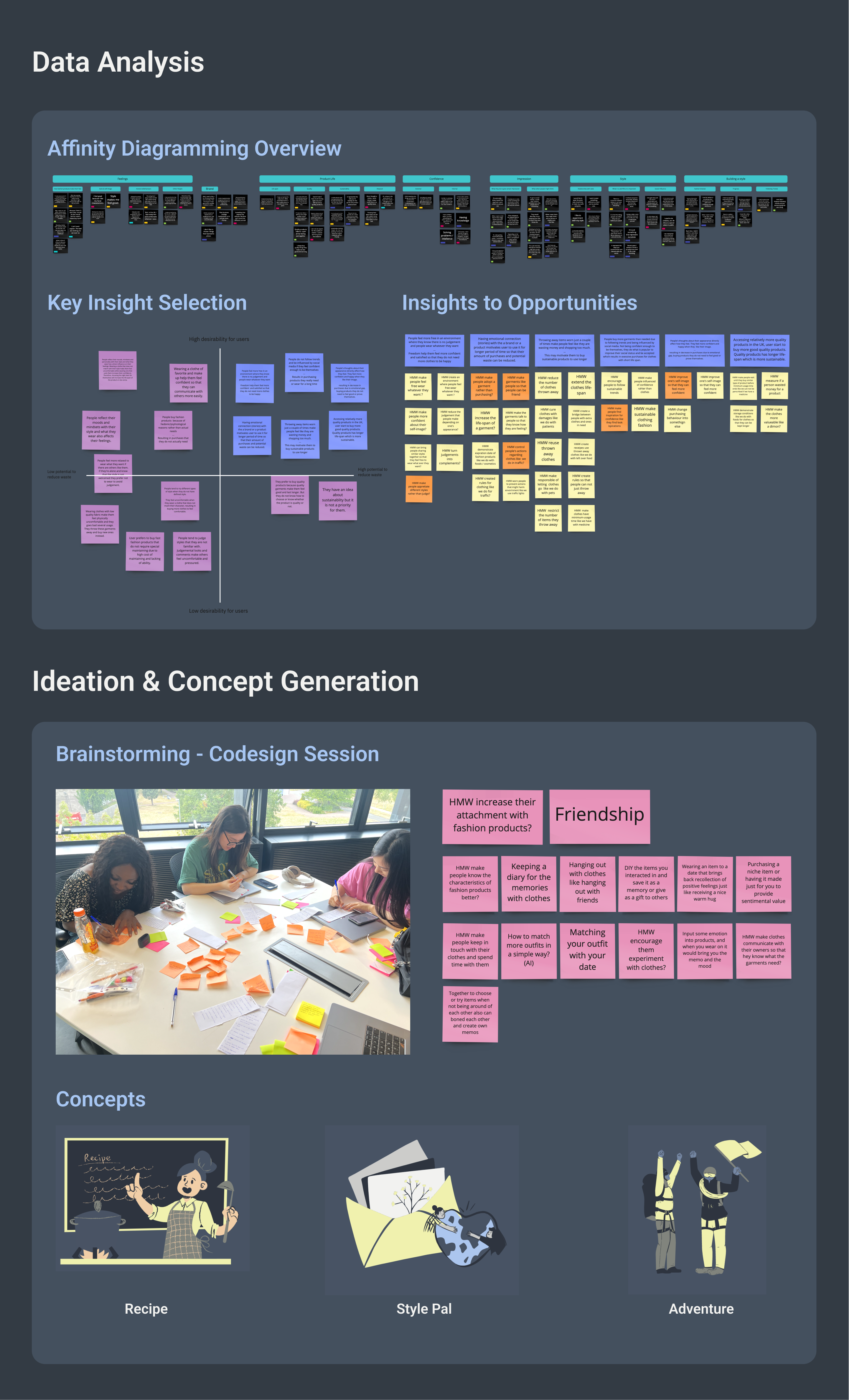
After the end of each research phase, I analysed the collected data with different methods depending on the data type. I employed thematic analysis to make sense of information I collected from auto-ethnography, observation and storytelling workshop. To see the patterns clearly of what people do, think and feel. To see individual consistency among workshop, videos and interviews, I analysed data using participant boards. In the end, I gathered all findings and analysed them, creating an affinity diagram to visualise the themes. The themes were how clothes make them feel, the product's life span, confidence, impression, style and building a style.
To bring diversity and increase creativity, I decided to have a brainstorming session with people from different backgrounds. We had an ideation session and came up with three concept alternatives: recipe, friendship and adventure.
Chichi Development Phase
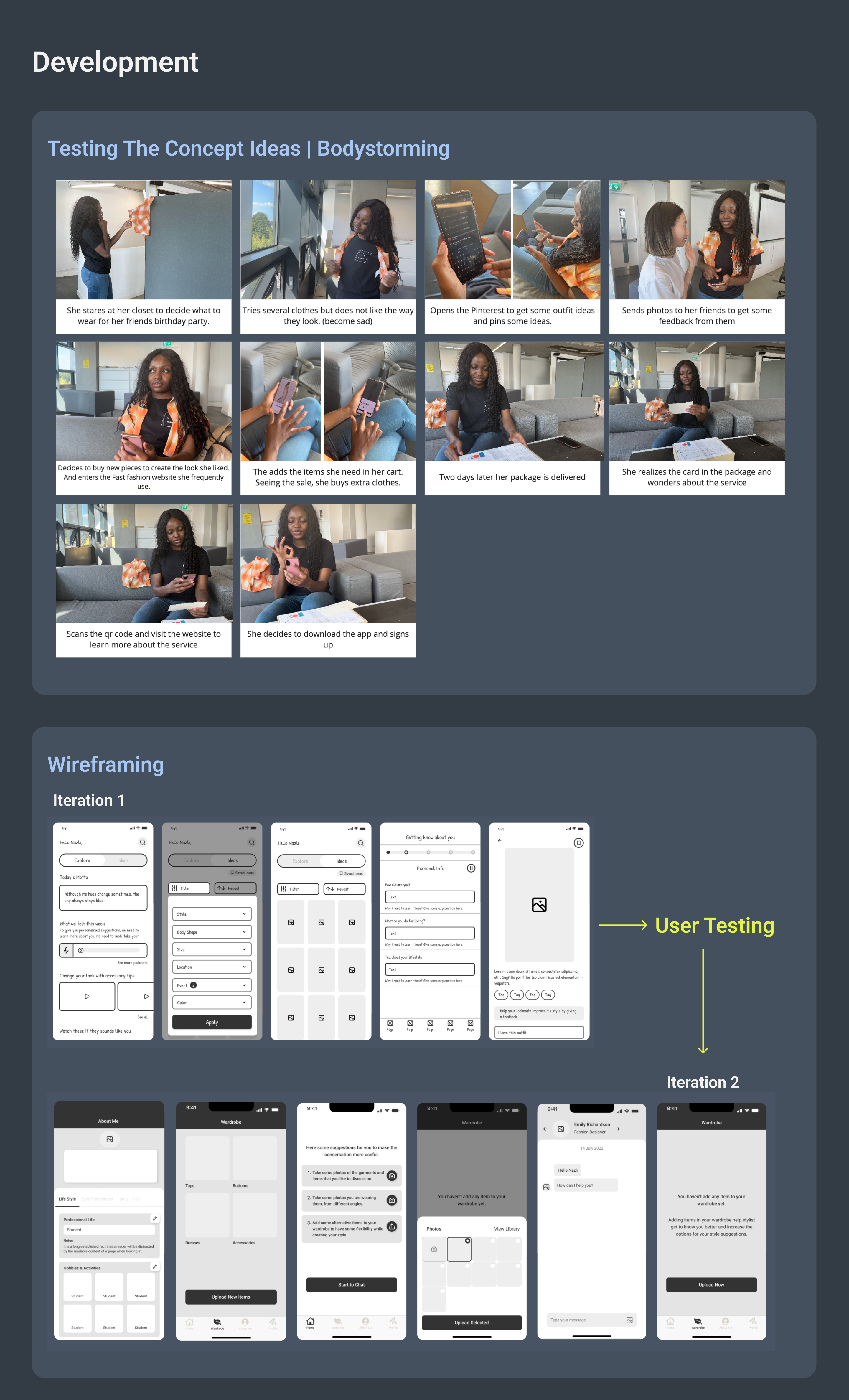
I did a bodystorming session with potential users to test the idea by acting the process out.
I started with hand-drawn wireframes and worked on alternatives for the development part. After that, I selected the options I liked and created a lo-fi prototype on Figma to test them. After getting feedback on my initial ideas, I revised them and moved on to high-fidelity UI design.
Service Design Project Process
Supreme Redesign
Nazli Gokcayir
Major project
Chichi
Awards
In 2019, I won 3rd place in an industrial design competition held by a government organisation and was awarded for being sponsored to study abroad master's education.
Work Experience
Product (UX/UI) Designer at Migros since January 2021
Migros is one of Turkey's top 5 e-commerce companies with 5 million users and daily orders of 40.000 and has a super app including its four brands and two brands with separate mobile apps.
My role here;
- Designing end-to-end online grocery shopping experiences for all brands by following design systems. (for IOS, Android and Responsive Web)
- Improving customer experience and increasing average cart amount by collaborating with multidisciplinary team members and gathering in-depth insights from user research.
- Conducting mixed research methods at various phases of development to test new experiences and evaluate existing versions.
