Alphabetti Spagh-Eddie is an illustrative, narrative project by a dyslexic designer, about dyslexia and for dyslexics exploring how text and imagery can be used to encourage children to read confidently.
Major project
Alphabetti Spagh-Eddie
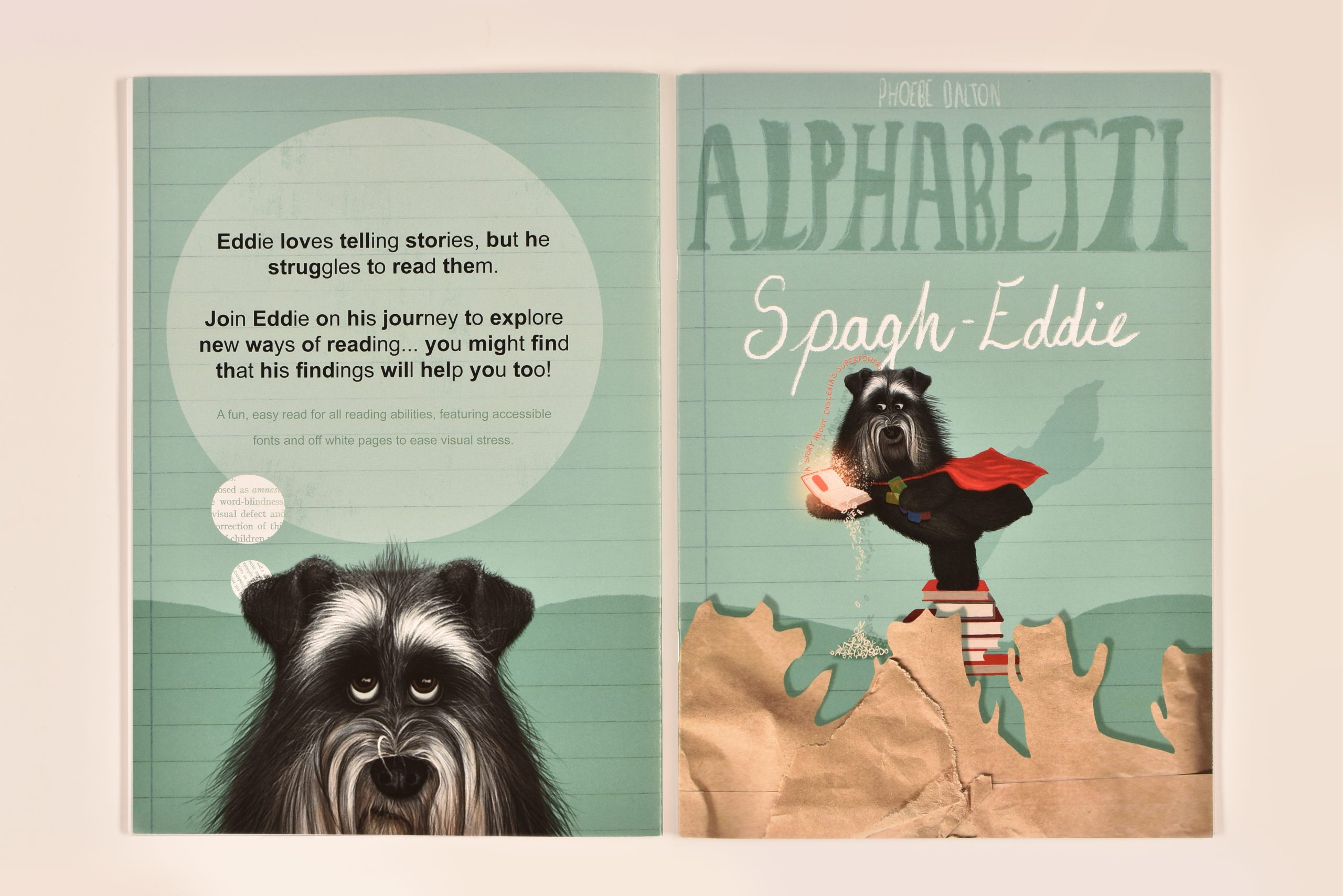
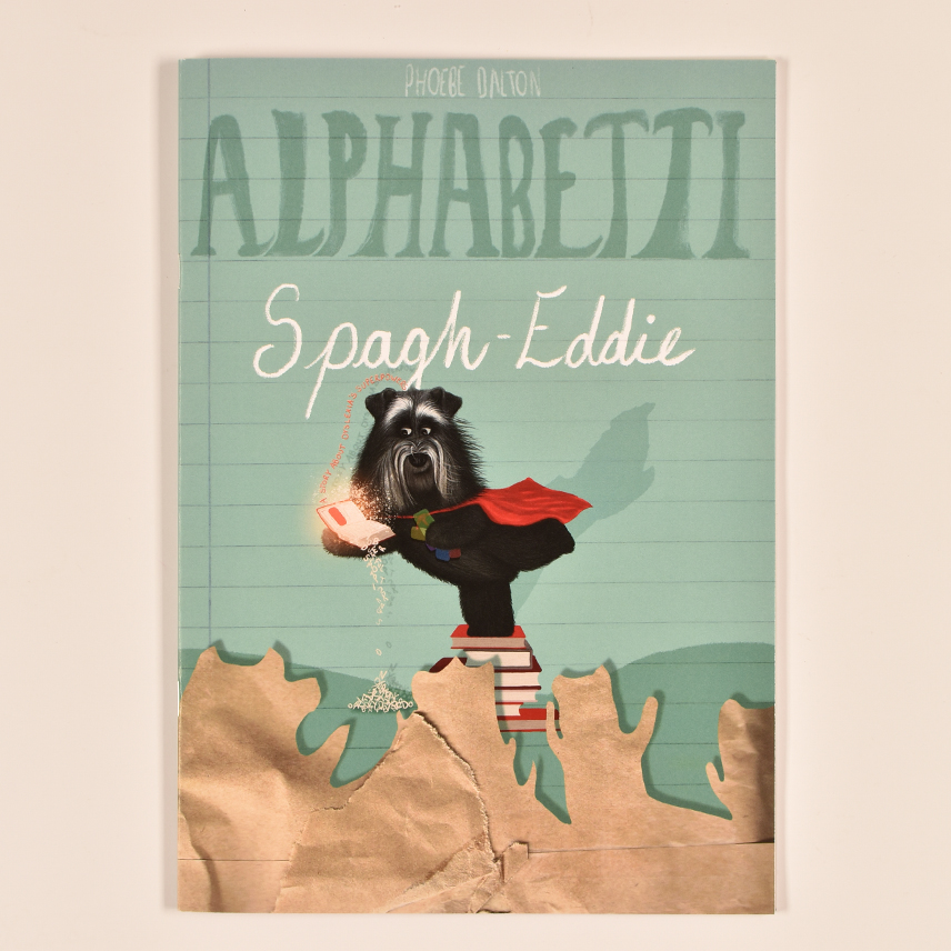
Front & Back Cover
Alphabetti Spaghetti is an educational resource that visually explains dyslexia’s realities through illustrations and typography. As dyslexia remains misunderstood in society due to its various (and complex) specificities as well as its ambiguous definition, this book is designed to focus on the treatment of dyslexia through its symptoms rather than its definition. Aimed towards children of ages 5-7, this book supports learning about dyslexia’s realities at an age where the symptoms start to show.
Like a textbook used in school, this children’s book is A4 and embodies the theme of education. It is saddle stitch bound to hold the translucent pages into place within the body of the book. In addition to this, off-white paper was used to reduce contrast between the black text and page easing the reading process for all. The aim of this was for children to view this book as something to learn from and to keep.
Accessible Font & Translucent Paper
To encourage readers of all abilities, this project incorporates accessible reading features that make reading easier and lessen visual stress. Inspired by the method used in Bionic Reading (Bionic Reading, n.d), this project uses typographic highlights to encourage fixation and focus on the most concise part of a word that is believed to improve the orthography-phonology process and essentially make reading easier for dyslexic and non-dyslexic individuals.
This project uses translucent materials that form the pages of text for the story. This method was used as an interactive element that illustrates how overlaying materials can ease the reading experience for those with dyslexia. Having it placed on top of plain, off-white pages illustrates how dyslexia affects the reading experience, but the off-white, itself, eases reading for all.
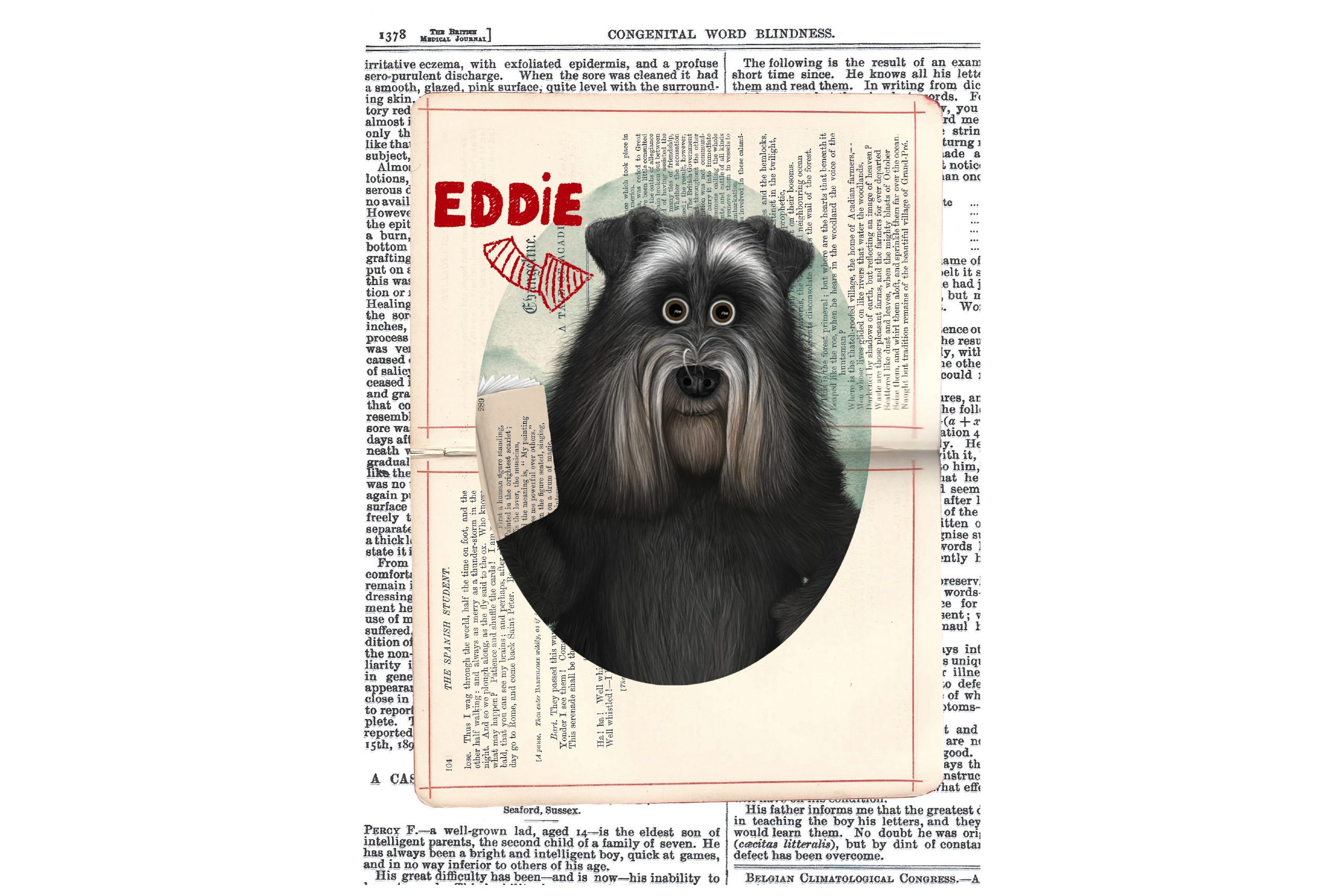
A Likeable & Relatable Protagonist
The main character, Eddie, is a miniature schnauzer who has dyslexia. He was designed with the intent to initially look unsure of himself, but flourish into a confident dog who loves to read. This was achieved through various drawings on Photoshop with a focus on expression to convey meaning. By showing his expression as sad, the chid reader is encouraged to empathise and support Eddie on his journey on exploring ways to read and feel happy when he finally finds a successful method. For children with and without dyslexia, Eddie may become a symbol of resilience and persistence and encourage those with reading difficulties to continue their exploration for their own unique way of reading.
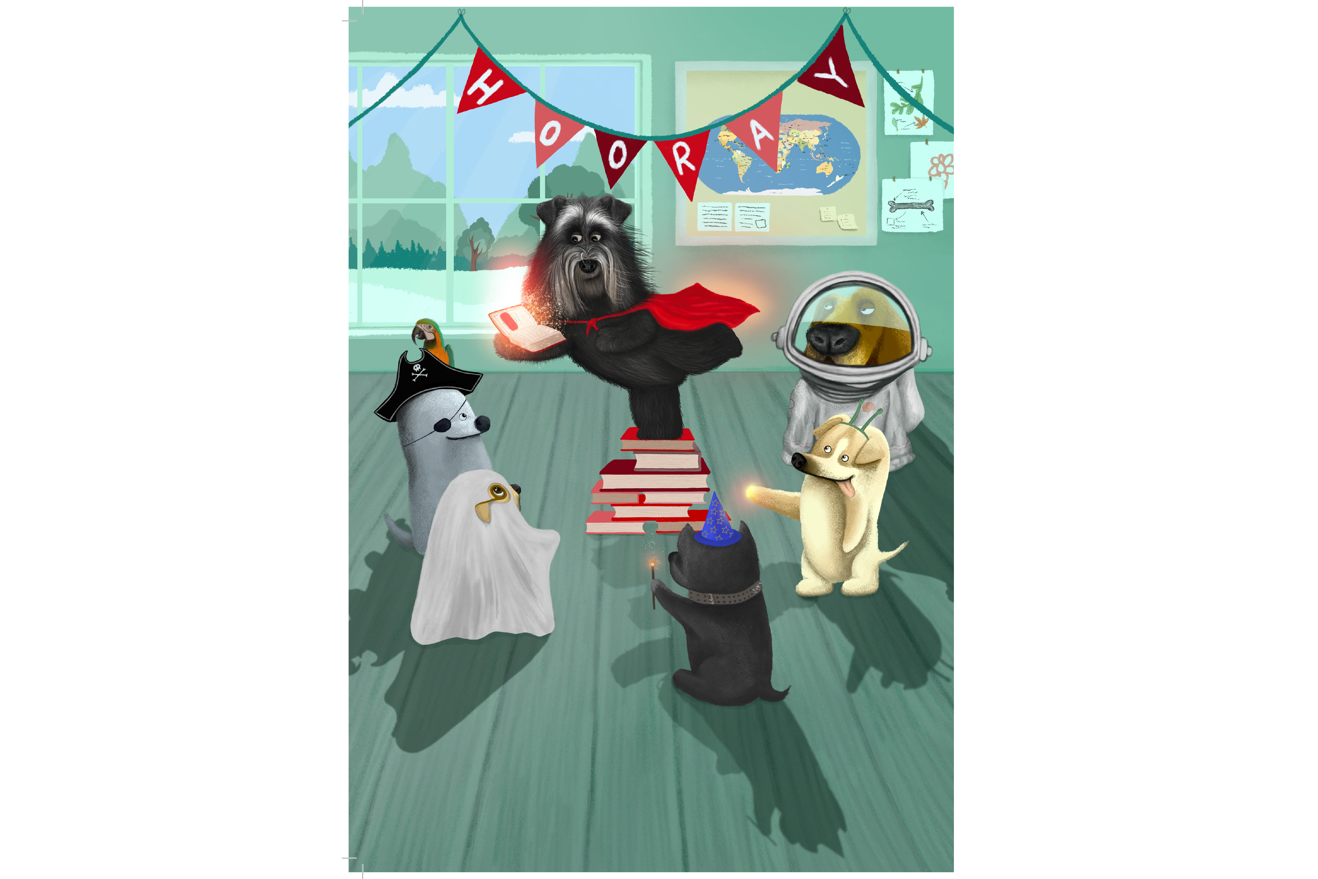
Supportive Classmates
Eddie’s classmates play an important role in the story. They represent acceptance and understanding of dyslexia in social and educational settings, but also support towards Eddie when he ‘overcomes’ his obstacle of reading. The aim of this was to set an example for children to show that dyslexia does not make you any less able, it just means you learn differently – and that is okay! Furthermore, as the story shows how the coloured overlays also help those without dyslexia, this may encourage more children of various reading abilities to use tools such as coloured overlays which will, in theory, mitigate feelings of social marginalisation and boost a dyslexic child’s confidence in the classroom.
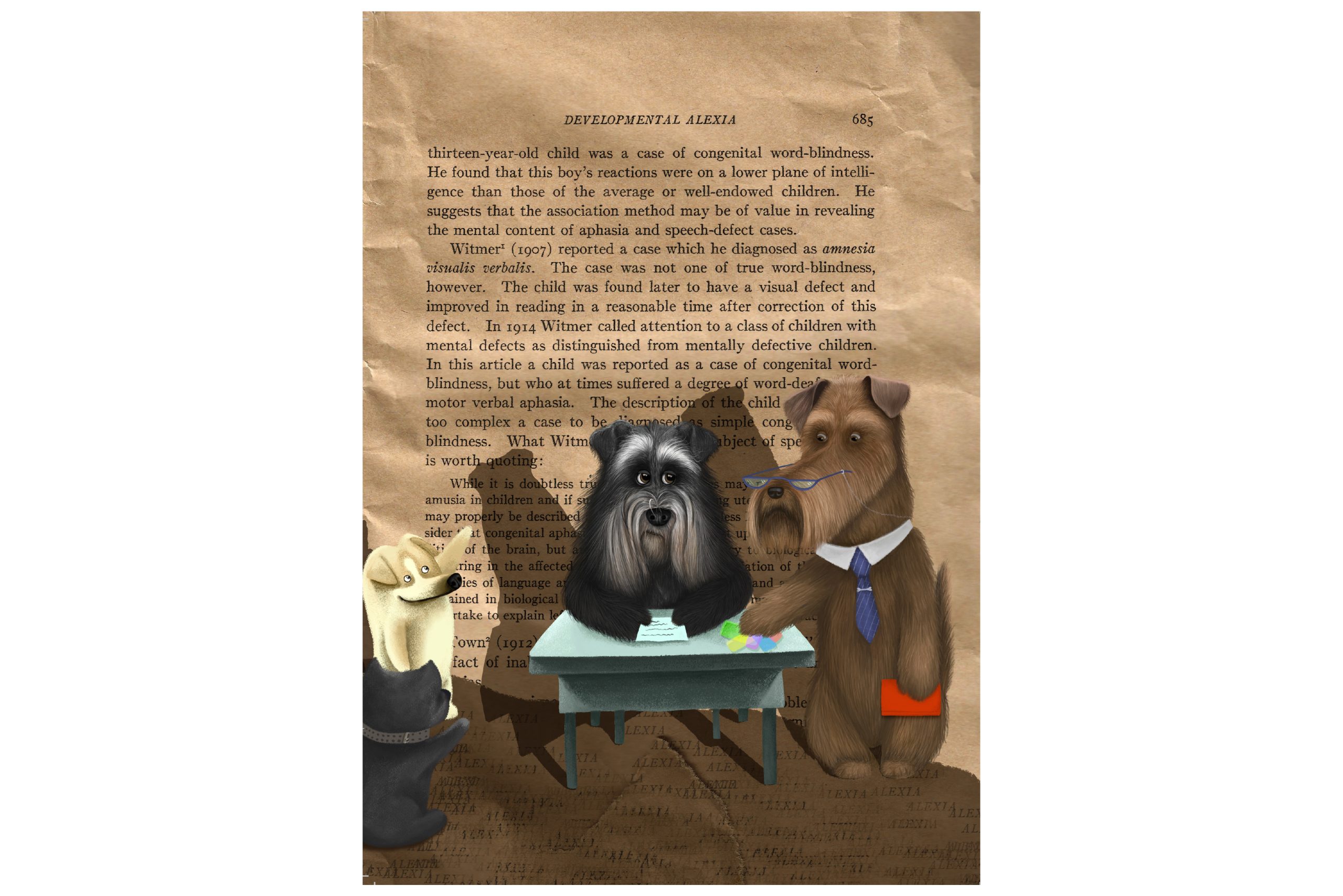
Mr Drow
Mr Drow (‘word’ backwards) is Eddie’s teacher. He plays the role of introducing the successful method that helps Eddie to read. Though implicit, Mr Drow ‘who knows all about these things’ may know about reading difficulties through his own experiences. Phoebe selected him to introduce the tool that eventually helps Eddie highlighting the importance of adapting pedagogical approaches towards dyslexia awareness and inclusivity in educational settings. Phoebe believes that education is the key to mitigating the social stigmas that still exist and adapted pedagogies may be a step in the right direction of treating dyslexia socially.
Illustrating with Collage
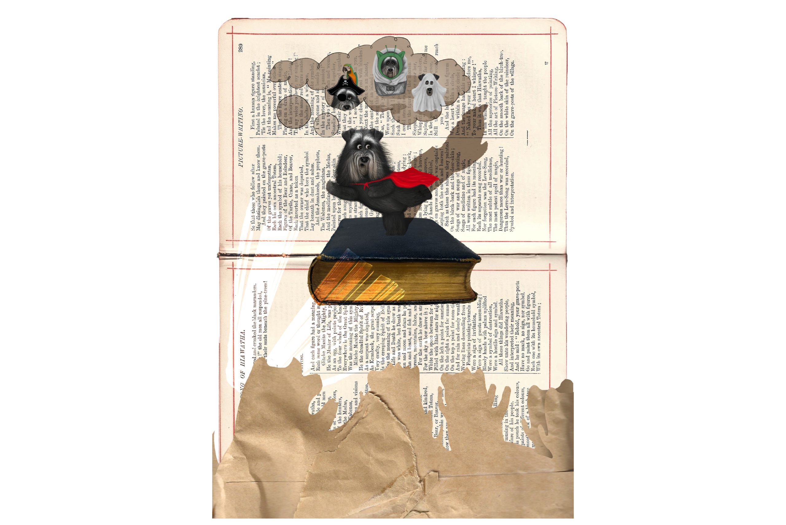
The project incorporates collages of scanned images of books, pages of books and historical 19th century studies of dyslexia that form the background and scene for many of the illustrations. This method was used to continue the theme of reading and books demonstrating the overwhelming effect it has on a dyslexic individual’s everyday life. By using older studies, particularly by W. Pringle Morgan (1896) and his description of dyslexia as ‘word-blindness’ (p.1378), this project literally uses dyslexia’s misunderstandings as a backdrop; a foundation for the stigma to be ameliorated through education in its realities.
Phoebe Dalton
Major project
Alphabetti Spagh-Eddie

